Chocolate Brown Dial Watches : Warm Tones Rising in High-End Collections | Luxyora
There was a time when watch dials played it safe, black for authority, silver for purity, blue for subtle flair. But lately, something richer has been stirring beneath the crystal. Chocolate brown dial watches are emerging as the warm, sophisticated alternative in high-end collections, offering depth, character, and a quiet kind of confidence that feels undeniably modern.
Not loud. Not flashy. Just deeply refined.
In a landscape where luxury is being redefined by nuance rather than noise, warm tones are rising, and chocolate brown is leading the conversation. From sunburst finishes to matte espresso textures, this dial color is proving that elegance doesn’t have to be cold to be timeless.
Let’s explore why chocolate brown dial watches are capturing attention, what makes them so compelling, and why they may be the next defining shade in contemporary horology.
The Shift Toward Warm Luxury
Over the past decade, luxury aesthetics have evolved. Minimalism gave us cool metallic palettes, steel greys, icy blues, stark whites. But as design trends mature, warmth is re-entering the frame.
Interior design has embraced caramel leathers and walnut woods. Fashion has leaned into earth tones and espresso tailoring. Even automotive finishes have shifted toward bronze and mocha metallics. Watches, naturally, are following suit.
Industry reports since 2018 indicate growing interest in colored dials that deviate from conventional black and silver. While green and blue have had their moment, brown offers something more enduring: richness without novelty.
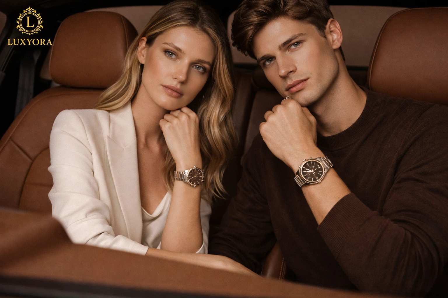
Chocolate brown dial watches bring a grounded sophistication that feels both classic and contemporary.
What Defines a Chocolate Brown Dial?
Not all brown dials are created equal. The true allure lies in tonal precision.
A chocolate brown dial typically features:
- Deep cocoa or espresso hues
- Subtle red or copper undertones
- Sunburst or brushed metallic finishes
- High contrast against polished or brushed cases
Under natural light, the dial shifts dynamically, appearing darker indoors and glowing warmly outdoors. This interplay of light and shadow adds dimension, making the watch feel alive rather than static.
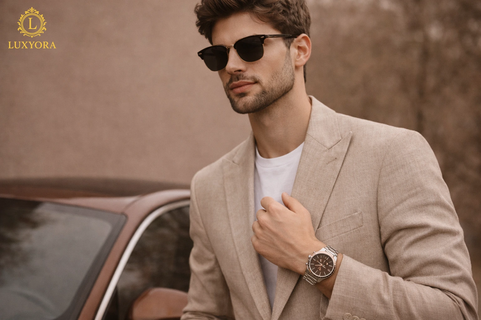
The warmth of the tone complements materials such as rose gold, bronze, yellow gold, and even brushed steel. It softens the austerity of metal while enhancing its richness.
The Psychology of Brown in Luxury Design
Brown, as a color, carries powerful associations. It symbolizes stability, authenticity, earthiness, and reliability. In luxury contexts, it conveys heritage and craftsmanship.
Recent studies in consumer psychology suggest that warm colors evoke emotional comfort and trust. In high-investment purchases like watches, emotional resonance matters. Buyers are not only choosing a timepiece but also an extension of their identity.
Chocolate brown dial watches communicate:
- Depth and maturity
- Subtle confidence
- A preference for understated refinement
- Appreciation for detail
Unlike trend-driven hues, brown feels enduring. It doesn’t demand attention; it earns admiration.
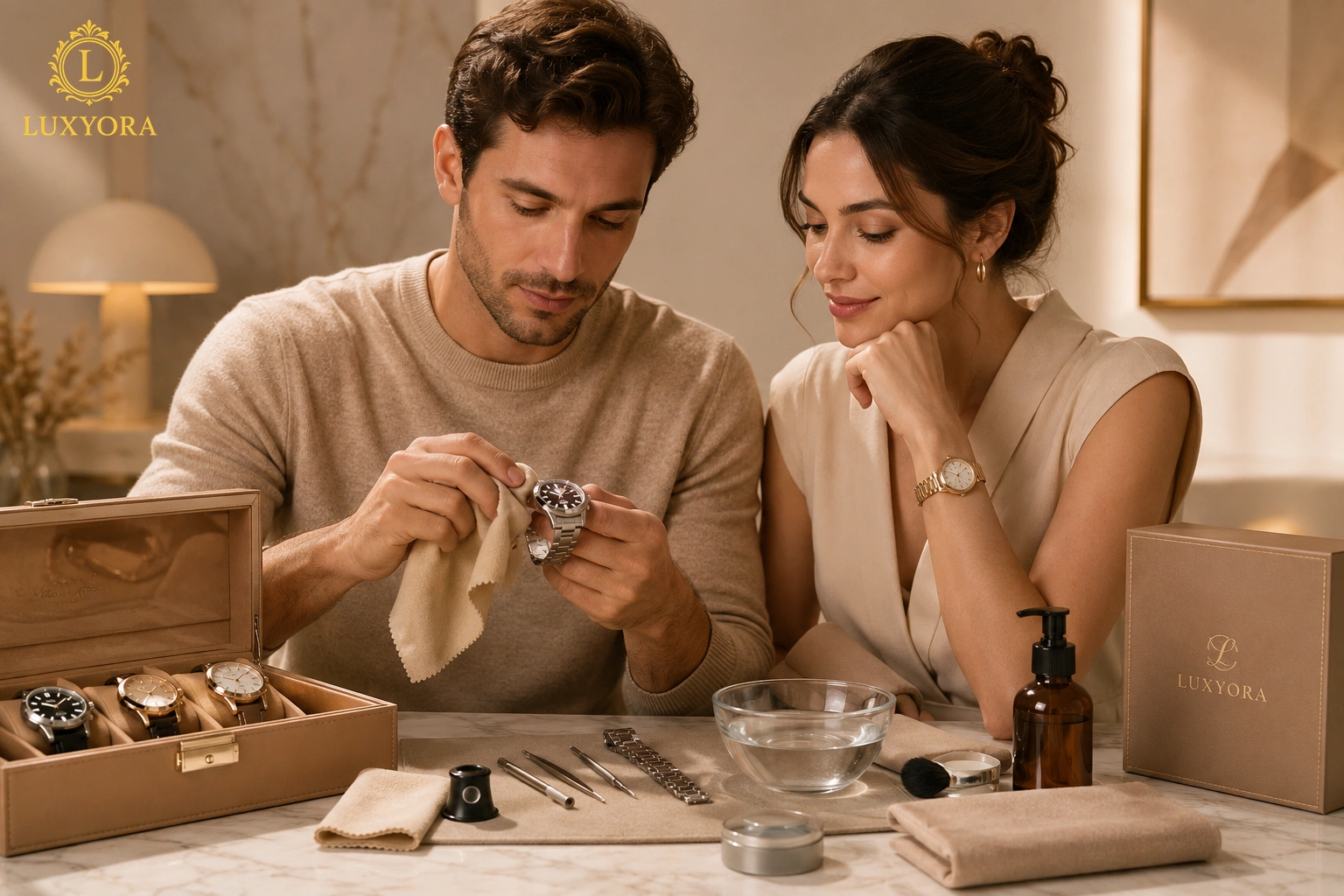
A Perfect Companion to Modern Wardrobes
One reason chocolate brown dial watches are rising in popularity is their styling versatility.
With Tailored Looks
Against navy or charcoal suiting, a brown dial introduces warmth without disrupting formality. It adds character to structured attire, softening sharp lines.
With Casual Layers
Pair it with cream knitwear, linen shirts, or leather jackets, and the watch becomes a cohesive accent. Brown harmonizes effortlessly with neutral palettes.
With Eveningwear
Under dim lighting, chocolate tones deepen beautifully. Paired with gold or bronze cases, the dial exudes quiet opulence, never ostentatious, always intentional.
In a world leaning toward tonal dressing and coordinated textures, chocolate brown feels right at home.
Chocolate brown dial watches are proving that quiet luxury doesn’t need to announce itself. Rich, warm, and unexpectedly versatile, these tones are finding their place in high-end collections and on wrists that understand styling is all about nuance. The real question isn’t whether to wear one, but what you wear it with. That’s a conversation continued in How to Match Watches with Outfits.
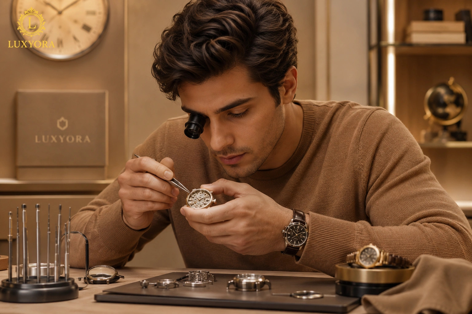
Craftsmanship Elevated by Color
Color in watchmaking is not just aesthetic; it is technical.
Creating a rich chocolate dial requires careful layering of pigments, precise brushing techniques, and controlled applications of lacquer. The depth must be consistent. The undertones must complement the case metal. The finish must interact elegantly with light.
Many chocolate brown dial watches feature:
- Radial sunburst brushing that enhances dimensionality
- Gradient or fumé effects that darken toward the edges
- Matte textures for contemporary minimalism
- Polished indices for striking contrast
The warmth of brown highlights these details differently than cooler tones. It absorbs and reflects light in a softer, more organic way.
Collectors often appreciate how brown dials reveal subtle nuances of craftsmanship that might be overlooked on darker or more reflective surfaces.
The Rise of Earth-Toned Horology
Trend forecasting since 2019 has consistently emphasized earth tones in luxury goods. From fashion runways to accessory design, warm neutrals have gained traction as symbols of grounded elegance.
Watches are uniquely positioned within this movement. Unlike clothing, which changes with the seasons, timepieces are long-term investments. Choosing a dial color aligned with broader design movements increases longevity.
Chocolate brown dial watches feel rooted in nature. They evoke leather, wood, coffee, and autumn light. These references are universal and timeless, reinforcing their staying power.
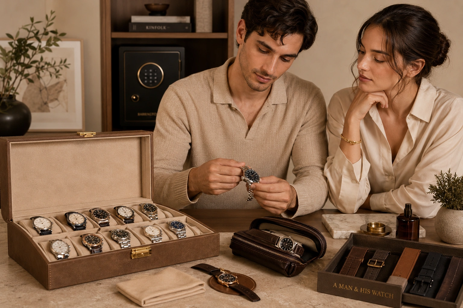
Collectibility and Investment Potential
In the world of horology, distinct dial variations often become defining features of specific production runs. Collectors pay attention to subtle shifts in color palettes.
Recent watch market analyses suggest that unique yet wearable dial colors hold strong resale value when paired with respected craftsmanship and limited availability.
Chocolate brown sits in a sweet spot:
- Distinctive but not eccentric
- Warm but not seasonal
- Rich but not flashy
This balance enhances long-term appeal.
For collectors seeking diversification in their watch portfolio, a chocolate-brown dial offers contrast to traditional black, silver, or blue pieces without sacrificing versatility.
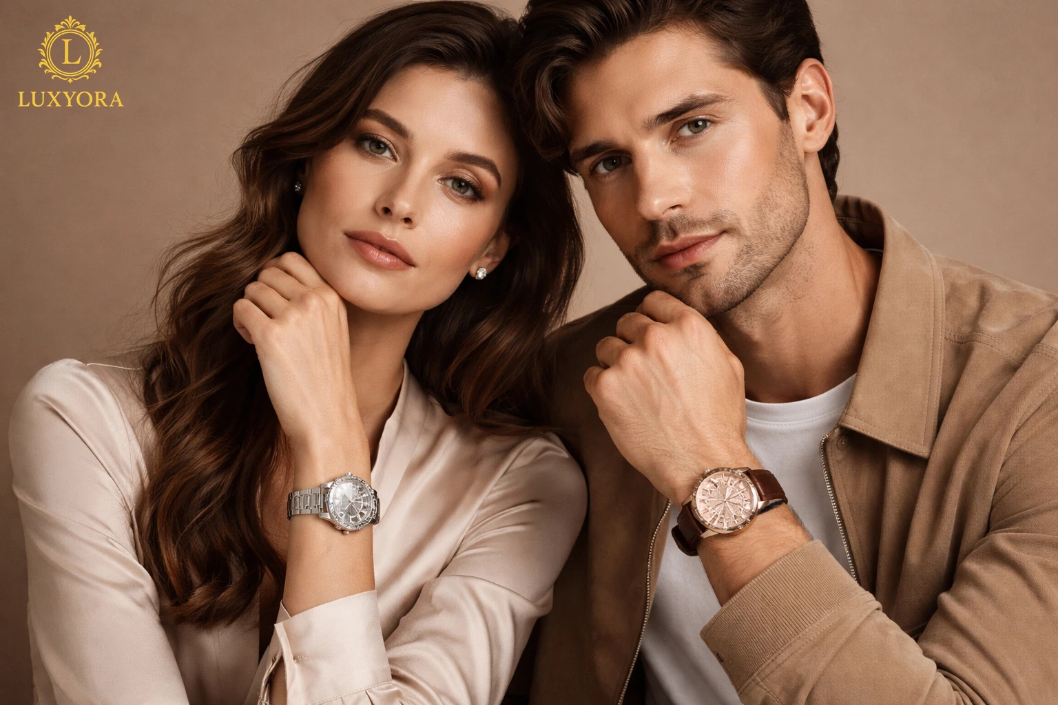
Gender-Neutral Sophistication
Modern luxury is increasingly fluid. Watch design is no longer confined to rigid categories.
Chocolate brown dial watches transcend traditional gender norms. On a slim case with refined proportions, the tone feels elegant and polished. On a robust sports model, it conveys rugged sophistication.
Its warmth flatters a wide range of skin tones, enhancing the piece’s overall aesthetic harmony on the wrist.
This universality contributes to its rising prominence in high-end collections.
Materials That Complement Chocolate Brown
One of the most compelling aspects of brown dials is their interaction with case materials.
- Rose gold enhances the dial’s copper undertones.
- Yellow gold amplifies its richness and warmth.
- Bronze creates a heritage-inspired aesthetic.
- Stainless steel offers modern contrast.
- Titanium balances warmth with a contemporary edge.
The interplay between dial and case becomes a study in contrast and cohesion.
Texture also matters. Leather straps in tan, dark brown, or even matte black create layered sophistication. Metal bracelets, on the other hand, emphasize structure and precision.
Sustainability and Timeless Design
Luxury consumers increasingly prioritize longevity and mindful purchasing. Reports from the past five years highlight a shift toward investment pieces designed to endure.
Chocolate brown dial watches support this philosophy. Unlike bold seasonal hues, brown is grounded in nature and heritage. It avoids the risk of rapid aesthetic fatigue.
Investing in a warm-toned timepiece aligns with sustainable consumption: fewer impulsive purchases, more thoughtful acquisitions.
A well-crafted brown dial watch can transition seamlessly across decades, adapting to evolving wardrobes and lifestyles.
The Emotional Connection
Beyond technical and stylistic considerations, chocolate brown dial watches resonate emotionally.
They feel comforting yet elevated. Familiar yet refined. There’s something deeply human about warm tones; they mirror the colors found in nature and everyday rituals, from coffee beans to aged wood.
In uncertain times, warmth becomes appealing. It grounds us. It reassures us.
A chocolate brown dial on the wrist feels like quiet confidence, a reminder that elegance doesn’t need to sparkle to shine.
The Future of Warm-Toned Timepiece
Will brown dials dominate watchmaking? Perhaps not dominant, but they will endure.
As the pendulum of luxury swings between cool minimalism and expressive warmth, chocolate brown occupies a stable middle ground. It is expressive without excess. Distinct without drama.
High-end collections are increasingly experimenting with tonal diversity, and brown has proven to be a relevant color. It satisfies collectors seeking originality while maintaining timeless appeal.
In the end, the rise of chocolate brown dial watches signals something broader: a renewed appreciation for depth, nuance, and warmth in design.
And that feels like more than a trend.
Warm-toned dials are redefining modern watch styling, bringing a sense of richness that feels both classic and current. Yet the difference between a beautifully styled look and one that feels unfinished often comes down to color relationships few people notice. Explore more in Color Guide – Matching Watch Dial Colors With Your Wardrobe.
Luxyora Philosophy: True luxury is not about brilliance alone; it is about depth. Warmth, like time itself, becomes more beautiful the longer you hold it.
References:
Deloitte. (2023). Swiss watch industry study 2023: Time to turn the tide. Deloitte Insights.
Kapferer, J.-N., & Bastien, V. (2020). The luxury strategy: Break the rules of marketing to build luxury brands (3rd ed.). Kogan Page.
Kim, J., & Sullivan, P. (2019). Emotional branding and color psychology in luxury consumption. Journal of Retailing and Consumer Services, 50, 202–210.
McKinsey & Company. (2022). The state of fashion 2022: Luxury accessories outlook.
Pantone Color Institute. (2022). Color trend forecasting report: Warm neutrals in consumer design.
Statista. (2024). Global luxury watch market revenue trends 2018–2024.