How Colour Choices Can Make or Break a Jewellery Design | Luxyora
Colour is the first thing your eye registers and the last thing your memory keeps. Before you clock the cut, the carat, or the cleverness of a setting, colour has already told you what to feel: romantic, powerful, modern, vintage, playful, mysterious. In jewellery, colour isn’t decoration. Its direction.
And that’s exactly why it can make or break a design.
A ring can be flawless on paper, with perfect proportions and exquisite craftsmanship, yet still fall flat if the colour story is confused. Conversely, a simple silhouette can look breathtaking if the colours are in perfect conversation: metal tone, gemstone hue, saturation, skin warmth, lighting, wardrobe, and even the emotional “message” the piece sends.
Here’s how designers use colour like a secret weapon and why getting it wrong is instantly noticeable.
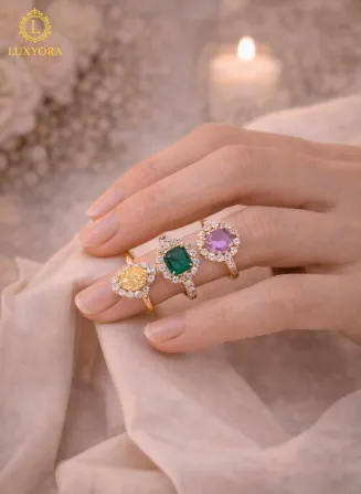
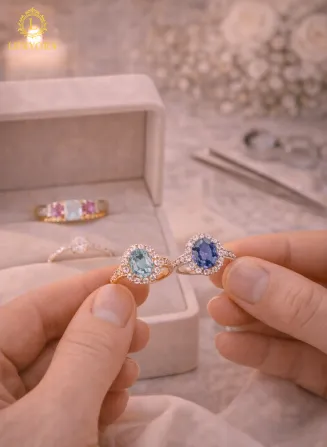
1) Jewellery colour isn’t one colour it’s a whole cast
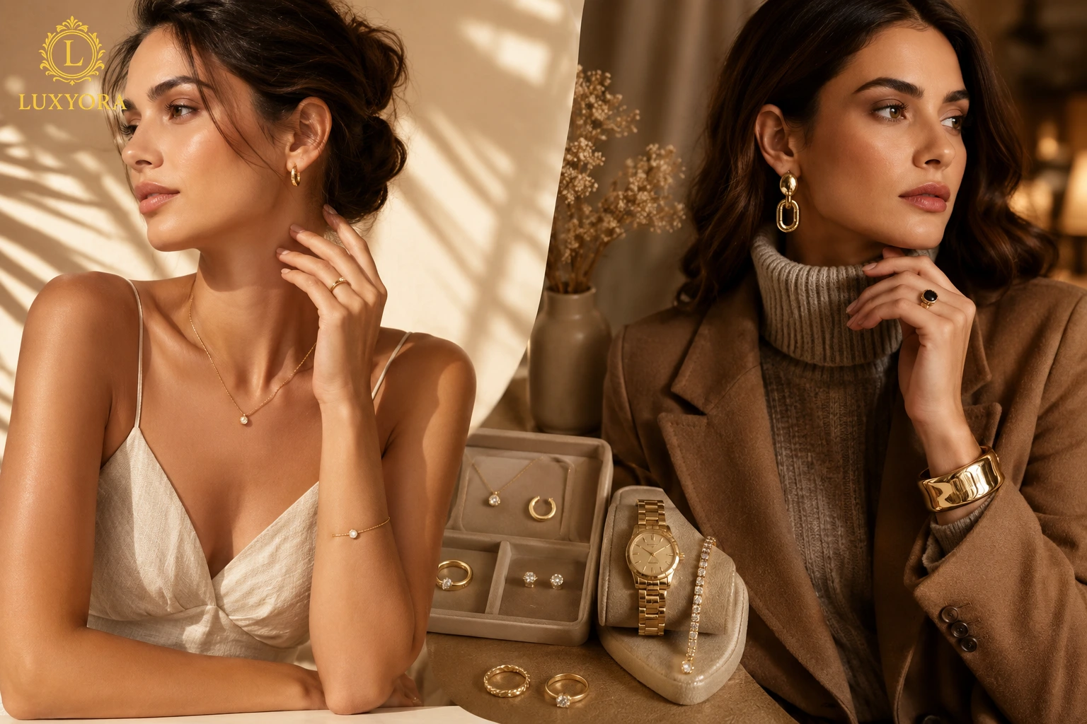
When people say “colour,” they usually mean the gemstone. Designers hear something bigger: metal tone + gemstone hue + sparkle behaviour + surrounding colours + skin.
That’s because jewellery colour is never isolated. A diamond doesn’t look the same in yellow gold as it does in platinum. A pink sapphire can look sugary and delicate in rose gold but suddenly editorial and cool in white metal. Even pearls change personality depending on whether they’re paired with warm champagne tones or crisp icy whites.
Designers build colour like a mood board you can wear. Every element either supports the story or distracts from it.
2) Hue, tone, and saturation: the trio that decides everything
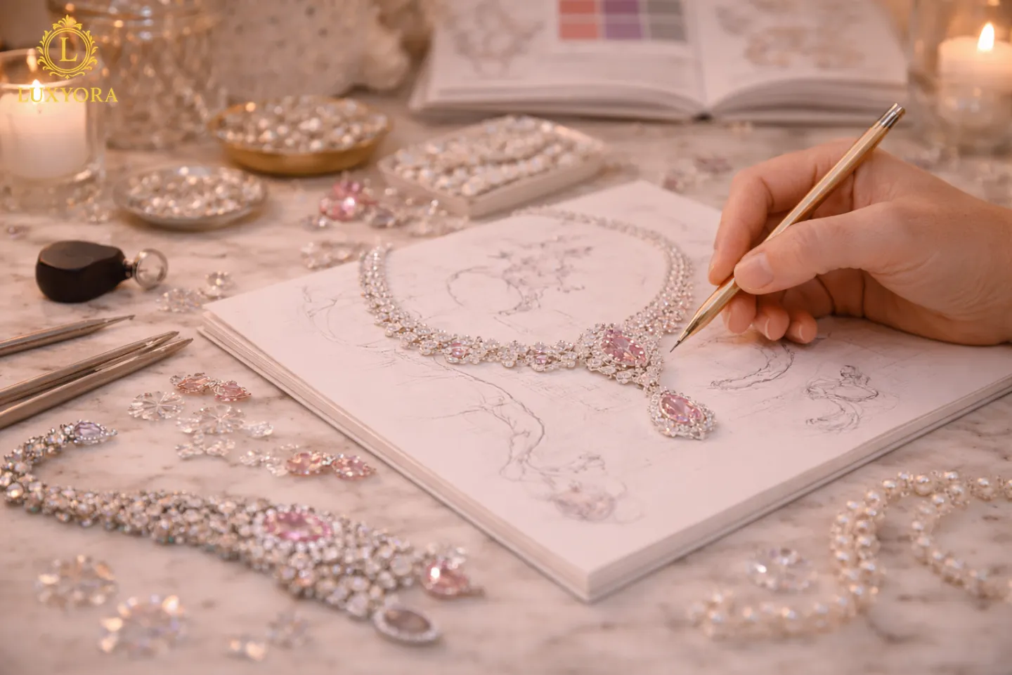
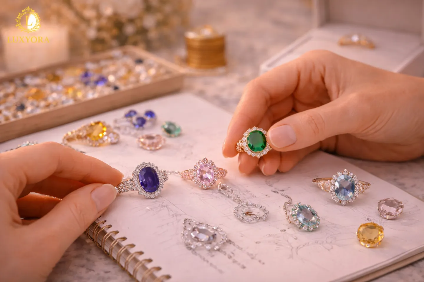
Gem colour isn’t just “blue” or “green.” It’s a combination of hue (what colour it is), tone (how light or dark), and saturation (how intense or muted). This is the difference between a vivid emerald green that feels unapologetically luxurious and a greyish green that can read tired under certain lighting.
Designers obsess over these three factors because they control how “alive” a stone looks. A muted stone can feel chic and understated if the design supports that softness. But a muted stone inside a highly glittery, high-contrast setting can look washed out, like it’s being shouted over.
The best designs match the stone’s personality to the setting’s energy.
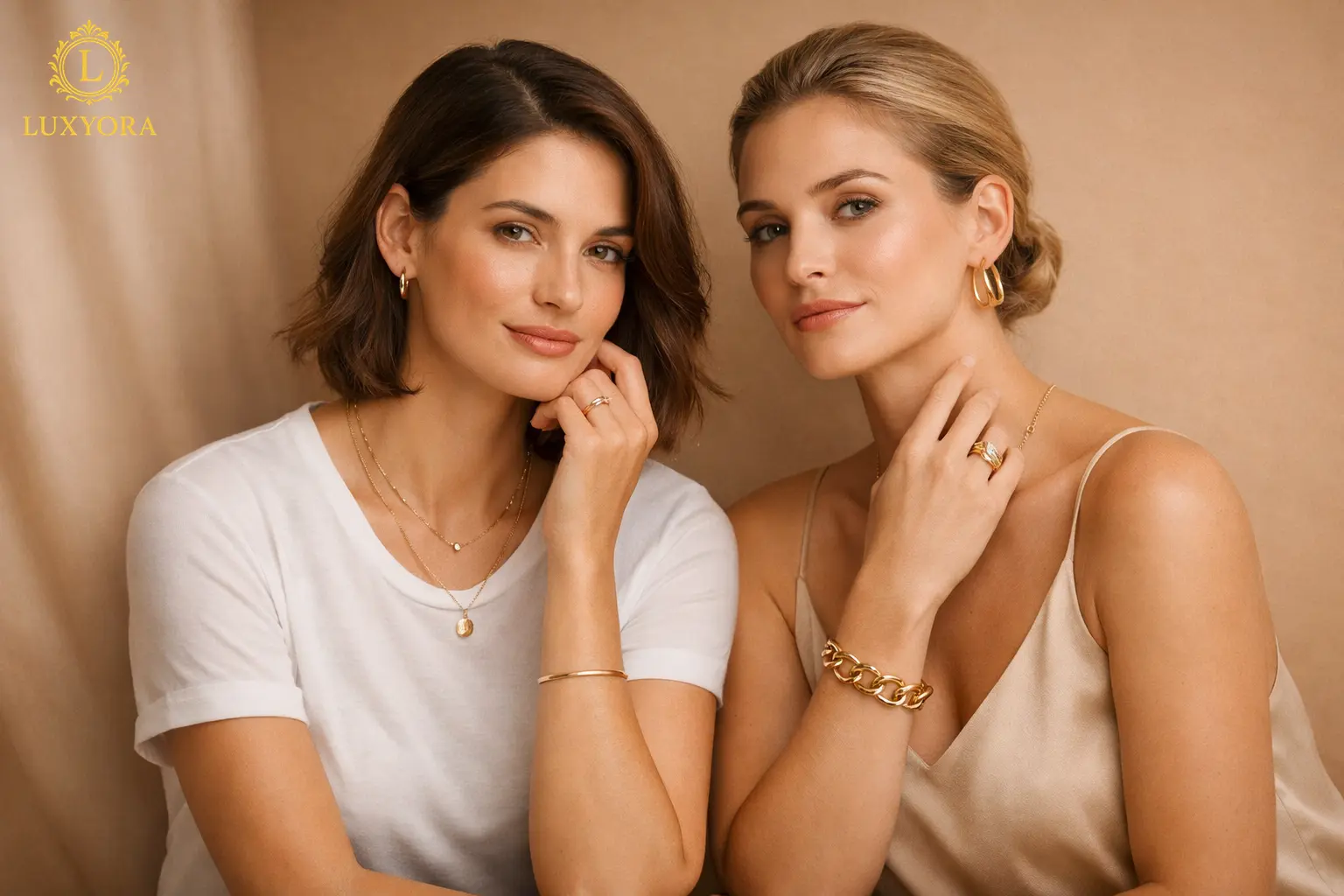
3) Metal colour is emotional shorthand
Metals do something gemstones can’t: they set the temperature of the entire piece.
- Yellow gold reads warm, classic, and quietly powerful.
- White gold/platinum reads crisp, modern, and ultra-clean.
- Rose gold reads romantic, glowing, and soft, sometimes too soft if the gemstone is also pastel.
A common design mistake is stacking warm-on-warm until everything blurs. Rose gold plus blush stones plus creamy pearls can be beautiful, but it can also become “one-note” if there’s no contrast to sharpen the look. Great designers add punctuation: a brighter diamond halo, a white-metal detail, a darker stone accent, or even negative space.
4) Contrast is the quickest way to make a piece look expensive
High jewellery has a habit of looking effortless, but it’s often powered by contrast: light against dark, cool against warm, matte against shine.
A deep blue sapphire in platinum? Electric. A black onyx detail next to diamonds? Instant drama. Even minimalist designs rely on contrast just in subtler ways, like a mirror-polished gold band catching a soft shadow line.
Without contrast, a design can look “flat” on the body, especially in photos (and yes, the camera is harsher than real life).
5) Lighting is a colour collaborator, and it’s not always loyal
Here’s the cruel part: jewellery colour changes depending on where you are.
Warm candlelight makes yellow gold glow like honey and turns some stones (especially pale pinks) into pure romance. Cool daylight can sharpen blues and whites but make warm metals look slightly brassy if the finish isn’t perfect. Indoor LED lighting can exaggerate certain tones and dull others.
Designers plan for this. They’ll choose stones and metal finishes that keep their charm across lighting conditions, or they’ll intentionally design for a specific vibe like evening jewellery that looks its absolute best under warm, flattering light.
6) Colour harmony is not “matching,” it’s balancing
A timeless colour palette is rarely about identical tones. It’s about harmony.
- Analogous palettes (colours near each other, like pink–peach–champagne) feel romantic and soft.
- Complementary palettes (opposites, like blue and gold) feel bold and luxurious.
- Monochrome palettes (all one family) feel modern and minimal if there’s texture and contrast.
When designs “break,” it’s often because too many colours compete without a hierarchy. If a necklace has emerald, ruby, sapphire, and diamond, the designer must decide who’s leading. Otherwise, it becomes a crowded conversation where nothing lands.
7) Skin tone and wardrobe matter more than people admit
Designers don’t design for a gemstone in a vacuum; they design for a person in motion.
Some colours naturally amplify certain complexions and styles. Warm metals often sing on warm undertones; cooler metals can look striking against cooler undertones. But rules aren’t laws; contrast can be intentional and gorgeous. The real question is: What is the piece meant to do on the wearer? Brighten? Soften? Add edge? Feel bridal? Feel powerful?
And then there’s wardrobe reality: a jewel that looks perfect against ivory silk might disappear against beige knitwear. Great design anticipates the wearer’s life, not just their special occasions.
8) Trend colours can elevate a design or date it overnight
Colour trends move fast. One year, it’s vibrant reds and magentas; another year, it’s soft, edible tones that feel comforting. These cultural colour moods influence jewellery, especially in enamel, gemstone choices, and styling.
Designers who use trend colours well do it with restraint: they let the silhouette stay classic while allowing colour to feel “now.” That way, when the trend shifts, the piece still holds up. The worst-case scenario is when the entire identity of the design is tied to a colour moment that passes, leaving the piece looking like a souvenir from someone else’s era.
9) The “break” moments: where colour goes wrong
A few common ways colour can sabotage an otherwise gorgeous design:
- The stone is too weak for the setting (a pale gem drowning in sparkle).
- The palette has no hierarchy (too many competing colours).
- Undertones clash (warm stones in a cool metal with no bridging element).
- No contrast (everything blends into one soft blur).
- The piece only works in one lighting scenario (stunning at night, dull by day).
Designers solve this by testing: viewing stones in multiple lights, placing them against metal samples, photographing prototypes, and adjusting until the colour story reads clearly.
10) When colour is right, the design looks inevitable
The best jewellery colour choices feel like they were always meant to exist. You don’t think, Nice colour. You think, That is perfect.
Because colour, done well, isn’t just visual. It’s emotional. It makes a piece feel modern or vintage, soft or fierce, quiet or iconic, without saying a word.
Luxyora Philosophy: Colour is the soul of design: when it’s chosen with intention, jewellery doesn’t just shine, it speaks. The most luxurious palette is the one that makes your story unmistakable at first glance.
References:
- Berg, A., Becker, S., Harris, T., & Thiel, A. (2021). State of Fashion: Watches and Jewellery. McKinsey & Company. (McKinsey & Company)
- Feld, W. (2019). The jewelry designer’s approach to color. Art Jewelry Forum. (artjewelryforum.org)
- Pantone Color Institute. (2023). Pantone Color of the Year 2024: PANTONE 13-1023 Peach Fuzz. Pantone. (Pantone)
- Shigley, J. E., & King, J. M. (Eds.). (2021). Gems & Gemology (Summer 2021 issue). Gemological Institute of America. (GIA)