How to Mix and Match Handbag Colors with Your Outfit | Luxyora
A handbag isn’t just something you carry; it’s a punctuation mark. It can whisper “old-money polish,” flirt with “city-girl energy,” or turn a simple outfit into a moment. And while people love to say “just pick what you like,” the truth is: a little color strategy makes the difference between random and refined.
The good news? Mixing and matching handbag colors isn’t about memorizing rigid rules. It’s about understanding a few style principles contrast, tone, temperature, and intention then using them to create outfits that look expensive, effortless, and entirely you.
Start With the Three Color Roles: Base, Supporting, Statement
Think of your outfit like a well-cast film:
- Base colors are your foundation: black, navy, cream, camel, chocolate, gray, denim, white.
- Supporting colors add personality without stealing the scene: soft pink, olive, taupe, burgundy, slate blue.
- Statement colors are the scene-stealers: cherry red, cobalt, emerald, fuchsia, sunshine yellow, metallics.
Your handbag can play any of these roles. The key is making sure it fits the “casting” of your outfit.
- If your outfit is loud, let your bag be the calm, luxurious anchor.
- If your outfit is minimal, let your bag deliver the drama.
- If your outfit is somewhere in between, choose a bag that echoes one tone already present (even subtly).
The Luxury Shortcut: Match Undertones, Not Exact Shades
What it is: A handheld
Here’s the styling trick that makes people assume you have a private shopper: stop chasing exact matches and start matching undertones.
- Warm undertones: camel, tan, rust, cream, gold hardware, warm reds, olive greens.
- Cool undertones: crisp white, charcoal, silver hardware, cobalt, icy pastels, blue-based reds.
- Neutral undertones: true black, balanced gray, some taupes, many leathers that read “mushroom.”
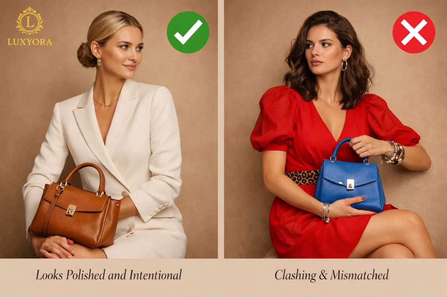
If your outfit leans warm, a warm bag looks intentional. If your outfit is cool, a cool bag looks clean and modern. And if you mix temperatures on purpose, say, a cool gray outfit with a warm cognac bag, it looks editorial when it’s clearly deliberate (more on that below).
Neutrals: The Bags You’ll Wear on Repeat
Neutrals are the backbone of a luxury wardrobe because they don’t compete; they compose.
Black
Black bags are sleek, graphic, and city-ready. They look especially sharp with monochrome outfits, tailoring, leather, and high-contrast palettes (black-and-white, black-and-red, black-and-camel).
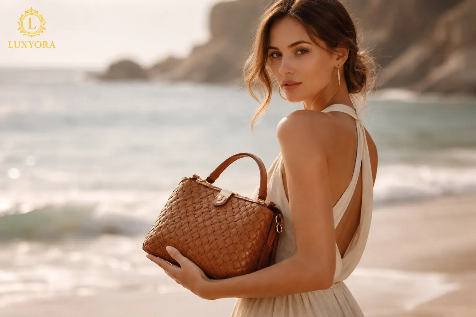
Tan/Camel/Cognac
These are the “quiet luxury” heroes. They soften dark outfits, elevate denim, and add warmth to creams, olives, and earthy tones. Cognac also plays beautifully with gold jewelry and warm makeup tones.
Beige/Taupe/Mushroom
When you want polish without harshness, taupe is your answer. It pairs with almost everything while keeping the look calm, expensive, and grown-up.
White/Cream
A pale bag looks fresh and elevated, especially against deeper tones (navy, black, espresso, forest). It’s also a surprisingly chic way to brighten winter looks when the styling stays clean.
Gray
Modern, understated, and quietly cool. Gray handbags love pastels, crisp shirting, and tonal outfits that feel architectural.
Tonal Dressing: The “Looks Expensive” Formula
Tonal dressing means staying in the same color family, but playing with depth, from light to dark. This is one of the easiest ways to make a handbag look like it belongs.
Try:
- Cream outfit + caramel bag
- Chocolate outfit + espresso bag
- Navy outfit + slate or ink-blue bag
- All-black outfit + black bag with texture (croc embossing, patent, suede)
Texture is your best friend here. When colors are close, texture creates dimension like a cashmere coat next to smooth leather, or denim beside pebbled calfskin.
Contrast Styling: When You Want the Bag to Pop (Without Looking Loud)
A contrasting bag can look impossibly chic if the rest of the outfit is composed.
The cleanest contrast pairings
- Black outfit + white bag
- Cream outfit + black bag
- Navy outfit + burgundy bag
- Gray outfit + cherry red bag
- Denim outfit + tan bag (classic, forever)
Contrast works best when your outfit is streamlined. If you’re doing volume, prints, or heavy layering, keep the bag simpler so the contrast reads as intentional rather than chaotic.
Color-Blocking With Confidence (Yes, You Can)
Color-blocking doesn’t have to look like a kindergarten art project. The secret is choosing one strong bag color and keeping everything else relatively calm.
A few combinations that always look fashion-forward:
- Cobalt bag + camel or beige outfit
- Emerald bag + black or cream outfit
- Red bag + gray, navy, or denim outfit
- Pink bag + soft neutrals (camel, dove gray, cream)
- Yellow bag + white, tan, or charcoal
If you’re new to bold bags, start with a small silhouette (a mini top-handle, a compact shoulder bag). It feels less intimidating, but still delivers impact.
Prints: Let the Bag “Pick a Color” From the Pattern
When your outfit includes prints, florals, stripes, checks, or animal prints, you have two elegant handbag options:
- Pull one color from the print (preferably not the loudest one).
- Choose a neutral that matches the print’s mood (black for high-contrast, tan for warm prints, gray for cool prints).
A leopard skirt? Black, tan, burgundy, or even forest green bags work depending on the vibe. A navy-and-cream stripe? A red bag looks iconic; a tan bag looks timeless.
Metallics: The Secret Neutral You’re Not Using Enough
Metallic bags are like jewelry for your outfit, and in the right finish, they function as neutrals.
- Gold reads warm and glamorous, especially with creams, browns, olive, and black.
- Silver reads cool and sharp, especially with gray, navy, white, and icy shades.
If you’re wearing minimal color, a metallic bag adds “event energy” without forcing you into a bright hue.
Shoe Matching: The Modern Rule
The old rule that your bag must match your shoes is outdated. The modern rule is more luxurious:
- Match the level of polish, not the exact color.
- Echo something small: a belt, jewelry tone, sunglasses, watch strap, or hardware.
For example: tan loafers + cream outfit + taupe bag = cohesive. Or black heels + navy dress + burgundy bag = sophisticated contrast.
If you do want a matching moment, make it look intentional by matching materials too (smooth leather with smooth leather, suede with suede). That’s what reads “stylist,” not “trying.”
Occasion and Lighting Matter More Than You Think
A color that looks perfect at brunch can look intense at night.
- Daytime: lighter neutrals, softer colors, woven textures, gentle contrast.
- Evening: deeper tones, glossy finishes, sharp contrasts, metallics, jewel colors.
And if you’re traveling between environments (office to dinner), choose a bag color that transitions: black, taupe, burgundy, navy, chocolate, or a refined metallic.
Build a “Color Wardrobe” for Bags (So You Always Have the Right One)
If you want a luxury-products approach, less clutter, more impact: build a tight edit:
- Primary neutral: black or taupe
- Warm neutral: camel/cognac
- Light neutral: cream or white
- Power color: red, emerald, cobalt, or pink (choose your personality)
- One wildcard: metallic, seasonal shade, or a color you adore
With those five, you can style almost anything without spiraling into “I have nothing to wear.”
The Final Styling Test: Does It Look Intentional?
Before you leave the mirror, ask yourself one question:
Does the handbag look like it was chosen on purpose?
If the answer is yes, you’re done. If it feels like an afterthought, anchor it to something else: hardware that matches your jewelry, a lip color that echoes the bag, a scarf detail that repeats the tone. Tiny styling echoes create big-luxury harmony.
Luxyora Philosophy: Luxury is never about matching perfectly; it’s about choosing with intention, so your style feels effortless and unmistakably yours.
References:
- Ahmad, S. (2020). Colour theory for fashion designer (eBook ed.). Independently published.
- Alterspark. (2019). Color psychology (Version 1.0) [PDF]. Behavioral Design Academy.
- Charles & Keith. (n.d.). The most versatile bag colours that match well with any outfit. Charles & Keith Guides. (Accessed 2026-02-11).
- InStyle. (2025, April 24). 8 classic handbag colors that go with everything. InStyle.
- Pantone. (2025). Pantone color of the year 2026: PANTONE 11-4201 Cloud Dancer. Pantone.
- Pantone. (2025). Pantone introduces the Pantone color of the year 2026: PANTONE 11-4201 Cloud Dancer [Press release]. Pantone.
- Techpack. (n.d.). Color theory in fashion and garments production. Techpack. (Accessed 2026-02-11).
- Time. (2025, December 12). Pantone chooses white as its color of the year for the first time ever. See it here. Time.
When you want polish without harshness, taupe is your answer. It pairs with almost everything while keeping the look calm, expensive, and grown-up.