How to Choose Clothing Colors That Complement Your Skin Tone | Luxyora
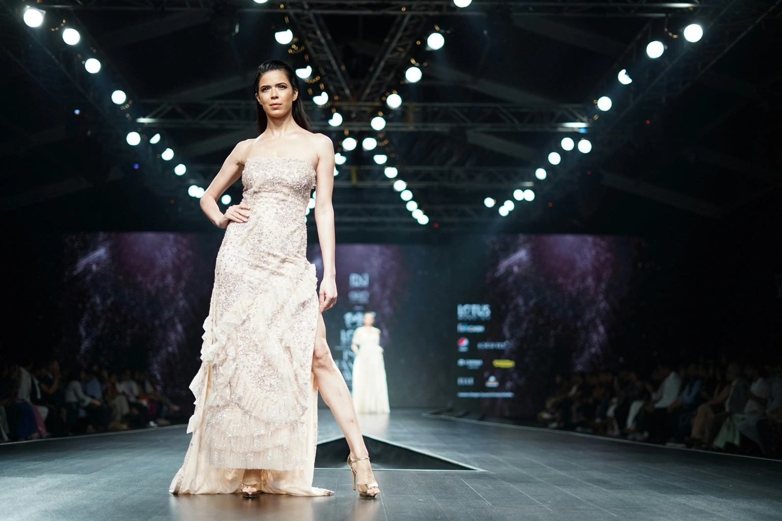
There’s a particular kind of magic when you slip on a piece of clothing in the right colour and suddenly your skin looks smoother, your eyes look brighter, and you look like you slept eight hours and drank water on purpose. That’s not a coincidence, it’s colour harmony. The right shades act like a ring light you can wear, while the wrong ones can make even the most expensive outfit feel… oddly exhausting.
The secret isn’t “fair vs deep” or “blonde vs brunette.” It’s understanding the undertone beneath your skin, plus a few underrated style editor details: how light or deep your colouring is overall, how bright or muted you read, and how much contrast you naturally have. Let’s make it easy, flattering, and very wardrobe-friendly.
Step 1: Separate “skin tone” from “undertone” (they’re not the same)
Skin tone is the surface depth (fair, medium, deep). Undertone is the subtle hue beneath the surface that stays relatively consistent even if you tan or lighten over time. Many beauty and dermatology sources describe undertones as warm, cool, or neutral, and you can get surprisingly far once you know yours.
Three quick undertone checks (do them in natural daylight):
1. Vein test:
- Blue/purple-looking veins → typically cool
- Green-looking veins → typically warm
- Hard to tell / a mix → often neutral
2. Jewelry test:
- Gold tends to flatter warm undertones
- Silver tends to flatter cool undertones
- Both can work on neutral
3. White vs cream test:
Hold a bright white top, then a creamy ivory top, near your face.
- If white looks crisp and “clean,” you may lean cool.
- If cream looks luxe and harmonious, you may lean warm.
- If both look good, hello neutral.
Important nuance: These are guides, not commandments. Lighting, tanning, and even a rosy flush can distort the test, which is why daylight matters.
Step 2: Identify your “temperature lane” (warm, cool, neutral… and the olive wildcard)
Once you have your undertone, think of it like choosing a lane on a highway. You can still move around, but your best looks live in that direction.
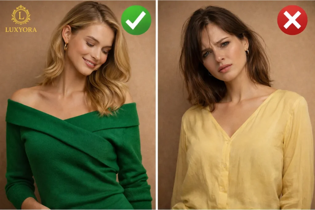
If you’re cool-toned
Your skin often reads pink, rosy, or bluish.
Your hero colours: icy pastels, jewel tones, crisp neutrals.
- Try: sapphire, emerald-leaning cool greens, cobalt, fuchsia, true red, lavender, icy pink
- Neutrals: charcoal, navy, cool taupe, optic white
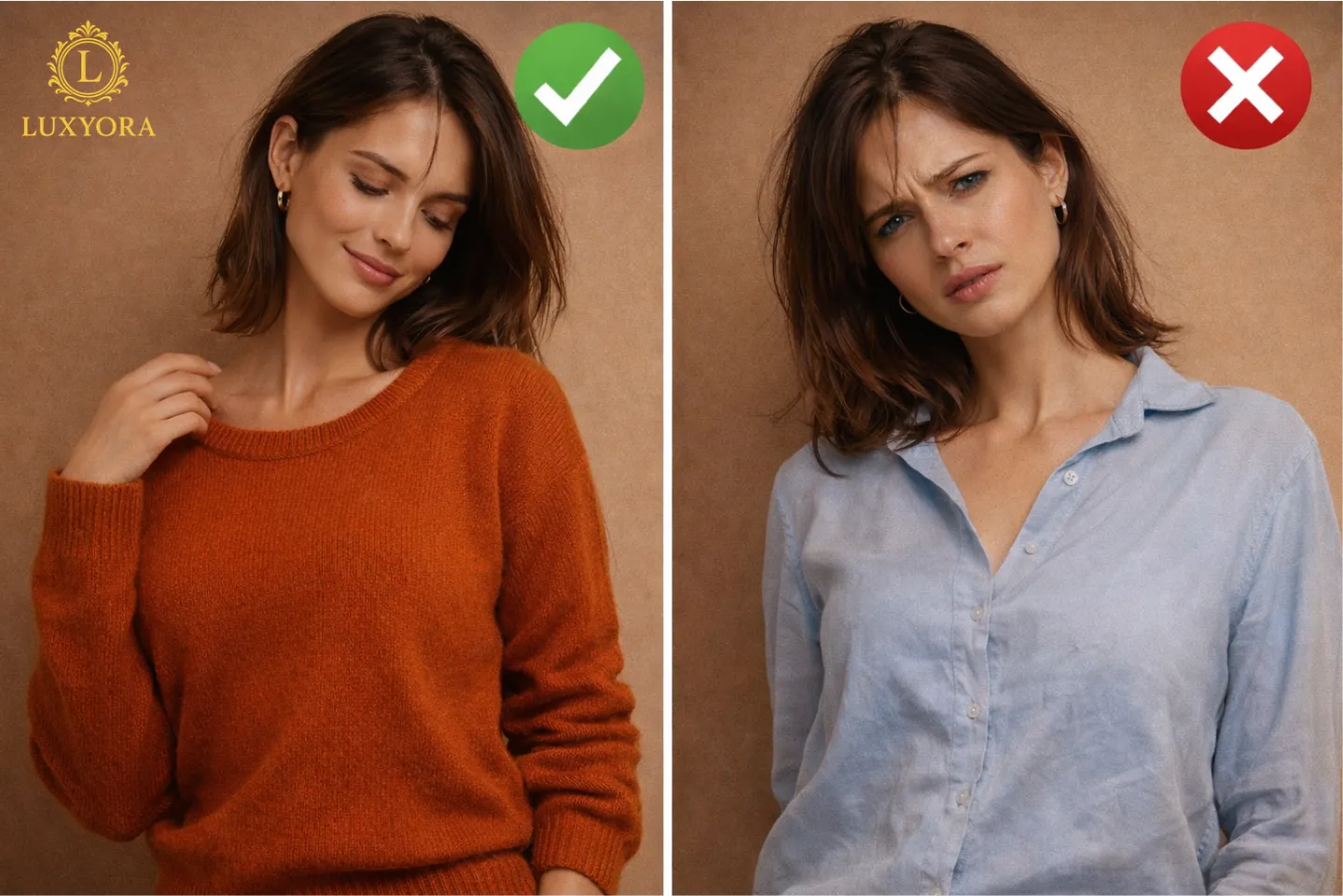
Avoid (or wear away from the face): very yellow-based shades (mustard, warm camel) that can make skin look sallow.
If you’re warm-toned
Your skin often reads golden, peachy, or yellow.
Your hero colours: earthy warmth, sunlit brights, creamy neutrals.
- Try: terracotta, coral, tomato red, marigold, olive, warm teal
- Neutrals: camel, warm beige, chocolate, ivory (instead of stark white)
Avoid: icy shades and blue-based pinks that can make you look a little “washed” near the face.
If you’re neutral-toned
You can play both sides, lucky you, but you’ll still have “best bets.”
Your hero colours: balanced tones and softened extremes.
- Try: dusty rose, soft jade, muted navy, medium denim, mauve, balanced reds
- Neutrals: greige, mushroom, soft white, mid-grey
Watch out for super-neon brights or extreme icy shades if they overpower your face.
The olive undertone (often misunderstood)
Olive skin can appear warm, cool, or neutral, with a subtle green/grey cast that changes with lighting. Olive undertones often look amazing in muted, sophisticated shades such as moss, khaki, espresso, deep teal, burgundy, and certain off-whites. If you find many foundations pull too pink or too yellow, olive may be your clue.
Step 3: Add the two “editor-level” filters: Value and Chroma
Undertone is your foundation. But the real “wow” factor comes from two style filters:
1) Value (how light or deep your overall coloring is)
Look at your hair, eyes, and skin depth together. If your features are generally light, ultra-deep colours can feel heavy. If your features are deep, pale pastels may fade out.
- Light overall colouring: cream, blush, sky blue, soft navy, light grey, sage
- Deep overall colouring: espresso, ink navy, forest, aubergine, rich camel, deep red
2) Chroma (how bright vs muted you look)
Some people glow in crisp, saturated colour; others look most expensive in softened, smoky shades.
- High chroma (clear/bright): jewel tones, clean brights, high-contrast combos
- Low chroma (soft/muted): dusty rose, muted teal, sage, mauve, smoky neutrals
Quick clue: If you put on a bright colour and it “wears you,” you may be muted. If you put on muted shades and you look tired, you may be bright.
Step 4: Use contrast like a stylist, match your natural “contrast level”
Contrast is the difference between your hair/eye depth and your skin depth.
- High contrast (e.g., dark hair + fair skin): looks incredible in bold pairings, black and white, deep navy with crisp ivory, saturated jewel tones.
- Low contrast (features close in depth): looks luxe in tonal outfits, camel with warm beige, slate with soft grey, dusty rose with mauve.
This is why some people look iconic in a black turtleneck, while others look instantly better in charcoal or espresso.
Step 5: Pick your best neutrals (because neutrals live near your face the most)
Neutrals are the backbone of a “quiet luxury” wardrobe, so choose ones that harmonise with your undertone.
- Cool undertones: optic white, charcoal, navy, cool taupe, dove grey
- Warm undertones: ivory, camel, caramel, warm beige, chocolate
- Neutral undertones: soft white, greige, mushroom, mid-grey, muted navy
- Olive-friendly neutrals: stone, khaki, espresso, soft black, muted cream
Choosing colors that complement your skin tone can instantly make a wardrobe feel more polished, but the most elevated looks rely on more than flattering shades alone. There’s an understated styling philosophy that turns good color choices into effortless sophistication. Discover more in The Do’s and Don’ts of Quiet Luxury Dressing.
Step 6: A flattering shortcut “face framing” colours do the heavy lifting
If you love a tricky colour, you don’t have to ban it. Just manage where it sits.
If a shade makes you look dull, wear it on your pants, a skirt, or shoes, away from your face.
Keep your best colours near your face: tops, scarves, collars, blazers, hijabs, ties, anything that reflects light upward.
Step 7: The final test (and it’s delightfully simple)
Try two tops in daylight:
- One that you think flatters you
- One that always feels “off”
Look for these signs:
- Do you see your face first or the colour first?
- Do your under-eyes look brighter or heavier?
- Does your skin look even or slightly blotchy?
- Do your lips look naturally more defined?
The “right” colour makes you look like you have better skin. The “wrong” colour makes you want more concealer.
Step 7: Wear the outfit with a body-positive lens
Try two tops in daylight:
- One that you think flatters you
- One that always feels “off”
Look for these signs:
- Do you see your face first or the colour first?
- Do your under-eyes look brighter or heavier?
- Does your skin look even or slightly blotchy?
- Do your lips look naturally more defined?
The “right” colour makes you look like you have better skin. The “wrong” colour makes you want more concealer.
Luxyora Philosophy: Colour isn’t a rulebook, it’s a love language between fabric and skin. Dress in shades that let you speak first, and let the outfit be your exclamation point.
References:
Harvey, V. M., et al. (2024). Integrating skin color assessments into clinical practice and research: Strengths and limitations of common approaches (Fitzpatrick limitations discussed). Journal of the American Academy of Dermatology. https://www.jaad.org/article/S0190-9622%2824%2900215-9/fulltext
Healthline. (2024, May 22). How to find your skin’s undertone. https://www.healthline.com/health/beauty-skin-care/skin-undertones
Hong, H. R., & Kim, Y. I. (2019). A mobile application for personal colour analysis. Cogent Engineering, 6(1). https://www.tandfonline.com/doi/full/10.1080/23311975.2019.1576828
Intertek. (2024, February 7). New version of care labelling standard published: ISO 3758:2023. https://www.intertek.com/products-retail/insight-bulletins/2024/new-version-of-care-labelling-standard-published-iso/
Oliveira, R., et al. (2023). An overview of methods to characterize skin type. Cosmetics, 10(1), 14. https://www.mdpi.com/2079-9284/10/1/14
Pantone LLC. (n.d.). PANTONE SkinTone Guide. (Retrieved January 31, 2026). https://www.pantone.com/skintone
Paula’s Choice. (2023). How to determine your skin’s undertone. https://paulaschoice.my/blogs/advice/how-to-determine-your-skins-undertone
DermNet NZ. (2023). Skin phototype (Fitzpatrick skin type). https://dermnetnz.org/topics/skin-phototype