Color Guide : Matching Watch Dial Colors With Your Wardrobe | Luxyora
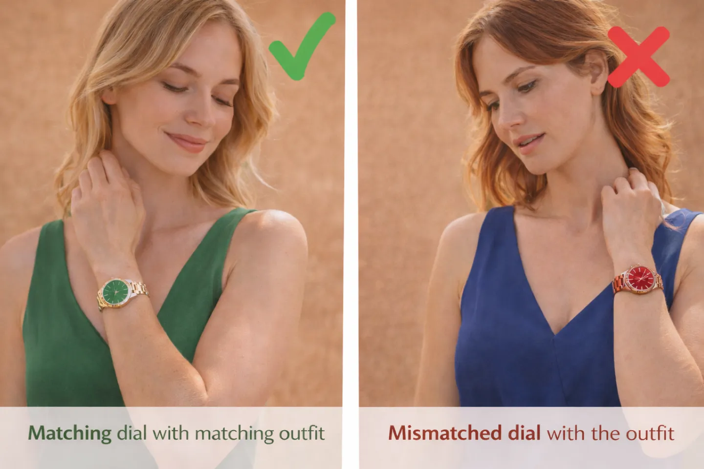
A dial color is the fastest way a watch changes from “nice timepiece” to “style decision.” It’s the wink across the room. The finishing touch. The detail that makes someone say, “Wait, what watch is that?” as if you’ve just revealed a secret.
If you’ve ever loved a watch in a display case and then felt oddly unsure once it hit your wrist, chances are it wasn’t the brand or the size; it was the color conversation between your dial and your wardrobe. The good news: you don’t need a fashion degree to get it right. You just need a few elegant rules, a little self-awareness, and the confidence to let one beautiful element lead.
Start With Your Closet, Not the Watch Box
Before you fall for a dial shade, take a quick inventory of what you actually wear. Most wardrobes lean into one of these “bases”:
- Cool neutrals: black, charcoal, crisp white, navy, steel gray
- Warm neutrals: camel, beige, cream, tan, chocolate, olive
- High contrast: lots of black-and-white, sharp tailoring, bold silhouettes
- Soft contrast: tonal dressing, textures, muted colors, gentle palettes
Your base determines what dial colors will feel effortless versus what will feel like an occasional “statement night.”
A simple approach: choose one “core dial” that matches your base, then add one “accent dial” that gives you personality.
The Universal Dial Colors (The Ones That Rarely Fail You)
If you want one watch to wear with almost everything, start here.
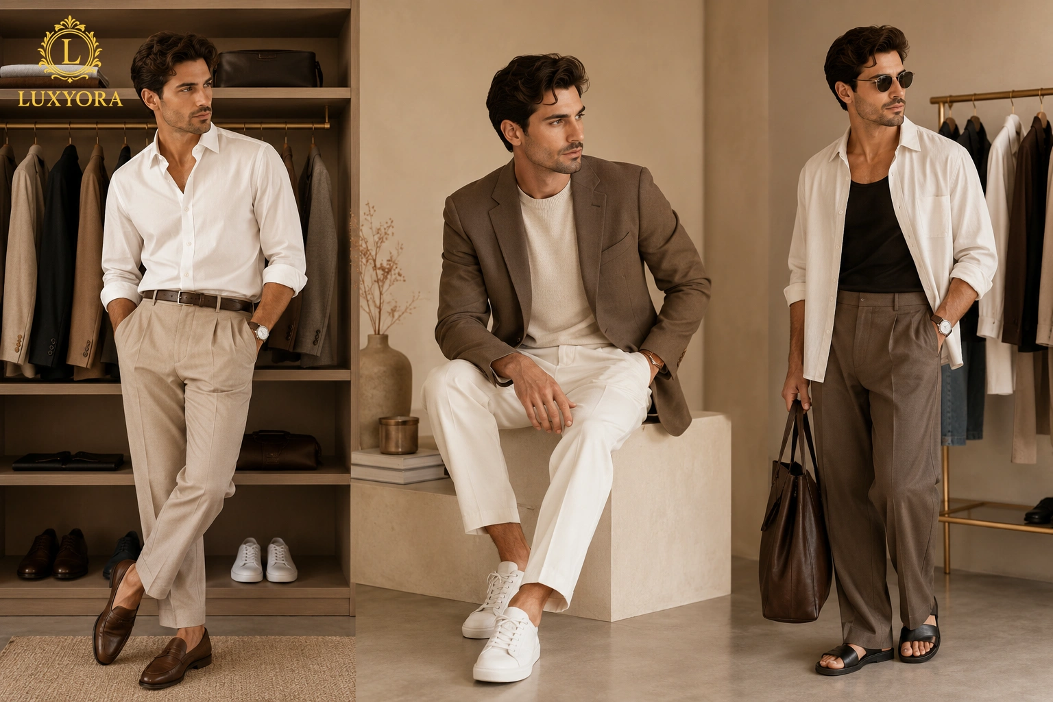
Black dials
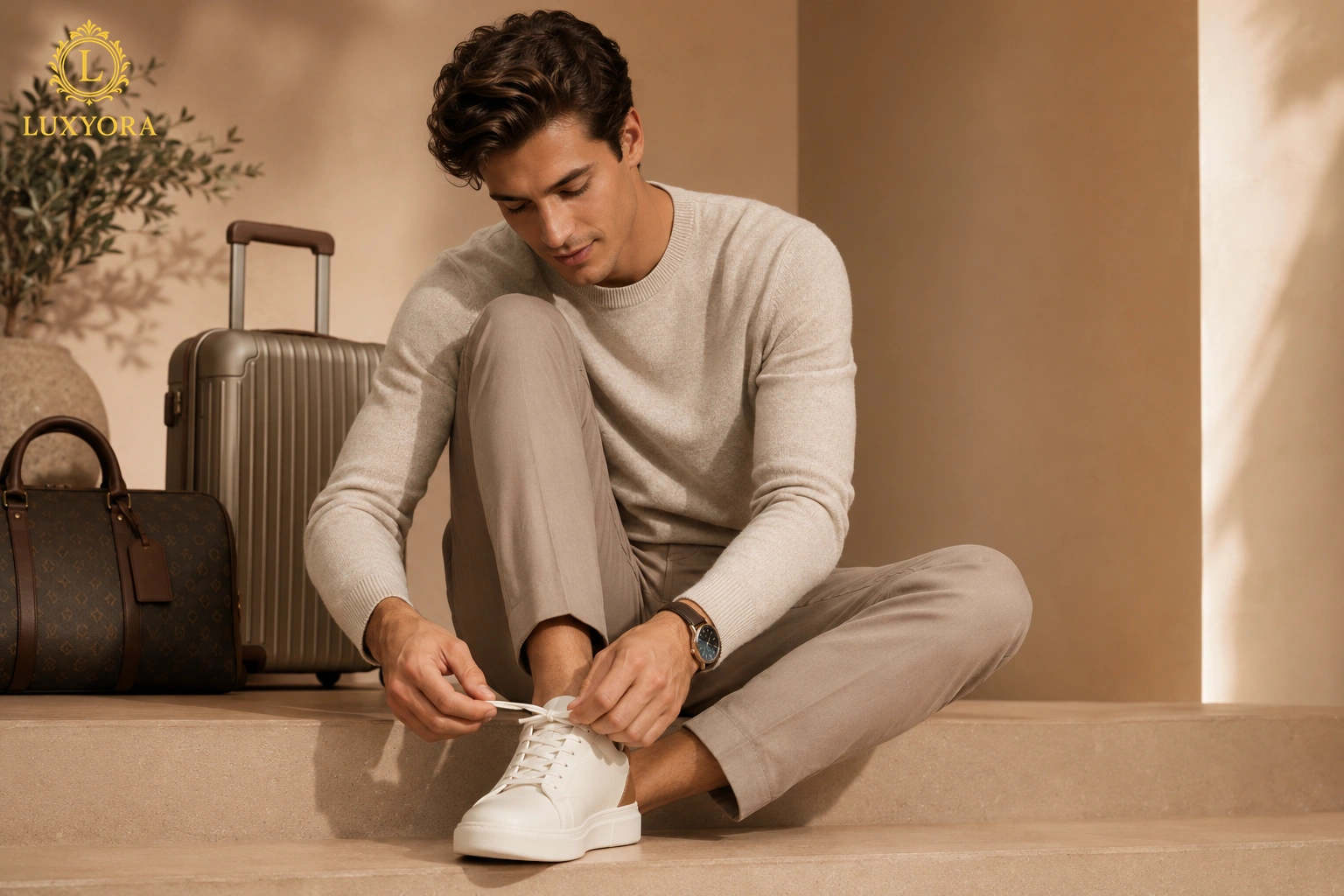
Black is the style equivalent of a perfect blazer, sleek, confident, quietly powerful. Black dials love monochrome outfits, sharp tailoring, leather jackets, and anything that reads modern. They also photograph beautifully, which matters more than we admit.
White/silver dials
Clean, classic, and bright. These dials work with linen, summer dressing, and light neutrals, and they’re perfect when you want elegance without intensity. White dials also elevate casual looks; suddenly, your T-shirt looks styled.
Blue dials
Blue is the “fashion neutral” that people forget is a neutral. It pairs with denim, navy suiting, gray knits, and crisp white shirts. A blue dial feels polished without making you look like you tried too hard.
Sometimes the most interesting shift comes from a shade that feels calm, modern, and unexpectedly versatile on the wrist. Explore the appeal in Ice Blue Dial Watches – The Cool-Toned Trend Gaining Luxury Attention.
If you’re building a watch wardrobe from scratch, black + white/silver is the easiest two-watch foundation.
Green Dials: The Modern Power Move
Green dials have had a well-documented surge in popularity, and they’re more wearable than people expect. The trick is to treat green as a refined neutral, especially in darker tones (forest, racing, bottle green). These shades pair beautifully with camel coats, navy, gray, cream, and black. They also look stunning with gold accents.
If your wardrobe already includes olive, brown, or warm neutrals, a green dial won’t feel “trendy.” It will feel intentional, like you know your colors.
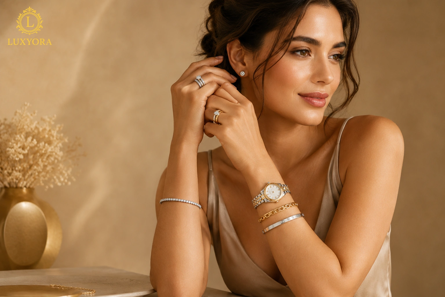
Champagne, Gold, and Warm Metallic Dials
Warm dials (champagne, gold-tone, bronze-adjacent hues) are pure golden-hour energy. They flatter cream sweaters, warm tailoring, and earth-tone outfits, and they look especially luxe with textured fabrics, such as cashmere, suede, wool, and silk.
A quick styling shortcut:
- Warm dial + brown leather strap = classic elegance
- Warm dial + gold bracelet = statement glamour
- Warm dial + all-neutral outfit = expensive without shouting
If you love jewelry and already wear gold, these dials feel like they belong.
Pink, Salmon, and Soft Pastels
These are the “quiet confidence” colors. Not childish editorial. Pastels work best when the rest of your look is clean and simple, so the watch feels like a deliberate detail rather than a random pop.
Try them with:
- white shirts and denim
- gray tailoring
- beige knits
- minimalist outfits with excellent proportions
Pastels are especially chic in spring and summer, but the real magic is when you wear them against winter textures, soft dial, heavy coat, perfect contrast.
Red, Yellow, and Bright Colors: How to Do It Without Looking Costumed
Bold dials are like lipstick: stunning when chosen with intention, messy when applied with panic.
Here’s the rule: let the dial be the only loud thing. Keep your outfit mostly neutral: black, white, gray, navy, beige, and allow the dial to play the starring role.
If you want a bolder dial that still feels luxe, look for deeper tones:
- burgundy instead of bright red
- mustard instead of neon yellow
- teal instead of electric turquoise
Choosing the perfect dial tone is often where watch styling begins not where it ends. Because the most memorable combinations rely on more than matching shades; they create balance across the entire look. Explore the details in How to Match Watches with Outfits.
Bold doesn’t have to scream. It can purr.
Your Undertone Matters More Than You Think
This is where everything clicks. If your skin undertone leans cool, you’ll often find steel, silver dials, blue, and crisp white especially flattering. If you lean towards warm, gold tones, champagne dials, brown straps, and green, they can look naturally harmonious.
No need to overanalyze what your mirror tells you. If a watch makes your skin look brighter and healthier, it’s a good match. If it makes you look slightly washed out, that dial tone may not be your everyday.
Matching the Dial to the Mood of the Outfit
Dial color isn’t just about matching clothes, it’s about matching energy.
- Formal looks: black, white, silver, deep blue, subtle textures
- Business casual: blue, green, charcoal, champagne
- Weekend casual: playful colors, lighter tones, textured dials
- Evening: black, deep green, warm metallics, high polish finishes
Choosing the right dial color isn’t simply about coordination, it’s about creating a watch presence that shifts effortlessly from one setting to the next. Some pieces seem to understand that balance instinctively. The conversation continues in Day-to-Night Watches That Work for Every Occasion.
A secret styling trick: tone-on-tone dressing (all creams, all grays, all navy) becomes instantly more interesting with a dial that’s in the same family, just one shade deeper or brighter.
The “Three-Color” Rule for Watches
If you ever feel overwhelmed, use a simple styling guideline: keep your outfit in no more than three dominant colors, and let the watch either:
- match one of them, or
- be the only accent color.
That’s how you avoid the “too much happening” feeling, while still looking creative.
Two Perfect “Dial Wardrobes” to Copy
If you want to build a dial lineup that feels chic and functional, here are two ready-made formulas:
The Minimal Luxury Capsule
- Black dial on bracelet
- White/silver dial on leather
- Blue dial (the elegant wildcard)
The Warm, Elevated Capsule
- Champagne dial (dressy hero)
- Green dial (modern neutral)
- White dial (fresh and versatile)
Once you have a formula, shopping becomes easier. You’re no longer hunting “a watch.” You’re curating a palette.
Luxyora Philosophy: A dial color is style in its most precise form: small, deliberate, and unforgettable. Choose shades that harmonize with your wardrobe, and your watch becomes less an accessory and more a signature.
References:
- Hodinkee. (2021, April 9). Why is every watch suddenly green? Hodinkee.
- Hodinkee. (2022, April 6). It looks like we’re finally done with uniform color trends. Hodinkee.
- InStyle. (2024). Mocha mousse: How to wear Pantone’s color of the year for 2025. InStyle.
- Pantone. (n.d.). Pantone color systems explained. Pantone.
- Schmidt, R. (2019). The wristwatch handbook: A comprehensive guide to mechanical wristwatches. ACC Art Books.
- Wristcheck. (2024, May 26). How to style colorful dials like a pro. Wristcheck.
- Lookiero. (2025, May 12). Colour wheel for matching clothes: A practical guide. Lookiero.